Heddels: Merging menswear enthusiast & contemporary fashion

Heddels began in 2011 as Rawr Denim, the Internet’s destination for learning about all things raw denim, and was reborn as Heddels in 2015 as a more comprehensive resource for a wider variety of products.

The Client

UK, Heddels

Design Role

User Interface Design, UX Design

Project Focus

Blogs, Internet, D2C, IA
Visit LorealVisit Website

The Upgrade: Open & breathable spacing without compromising brand ethos.

Already established as one of the go-to blogs of the U.K., and a well known name among men's fashion afficianado's, Heddles looked to re-invent themselves with this project.

The goal — not a full re-design of their website and mobile space, but rather a facelift that would result in better visitor engagement, reduce bounce rates and a more cohesive look and feel. With that in mind, I began the challenge of reconstructing certain components including the Footer, Related Articles, Homepage Sidebar, designing a new Shop component and updating the color palette and typography styles.

Heddels Wireframes:
For this project, I chose a modular layout beginning with wireframes.
Heddles Homepage:
The Heddels site begins with a minimal navigation structure, standard space for ad placements, and a hero section comprised of one large feature article and four smaller featured articles.
The Article List:
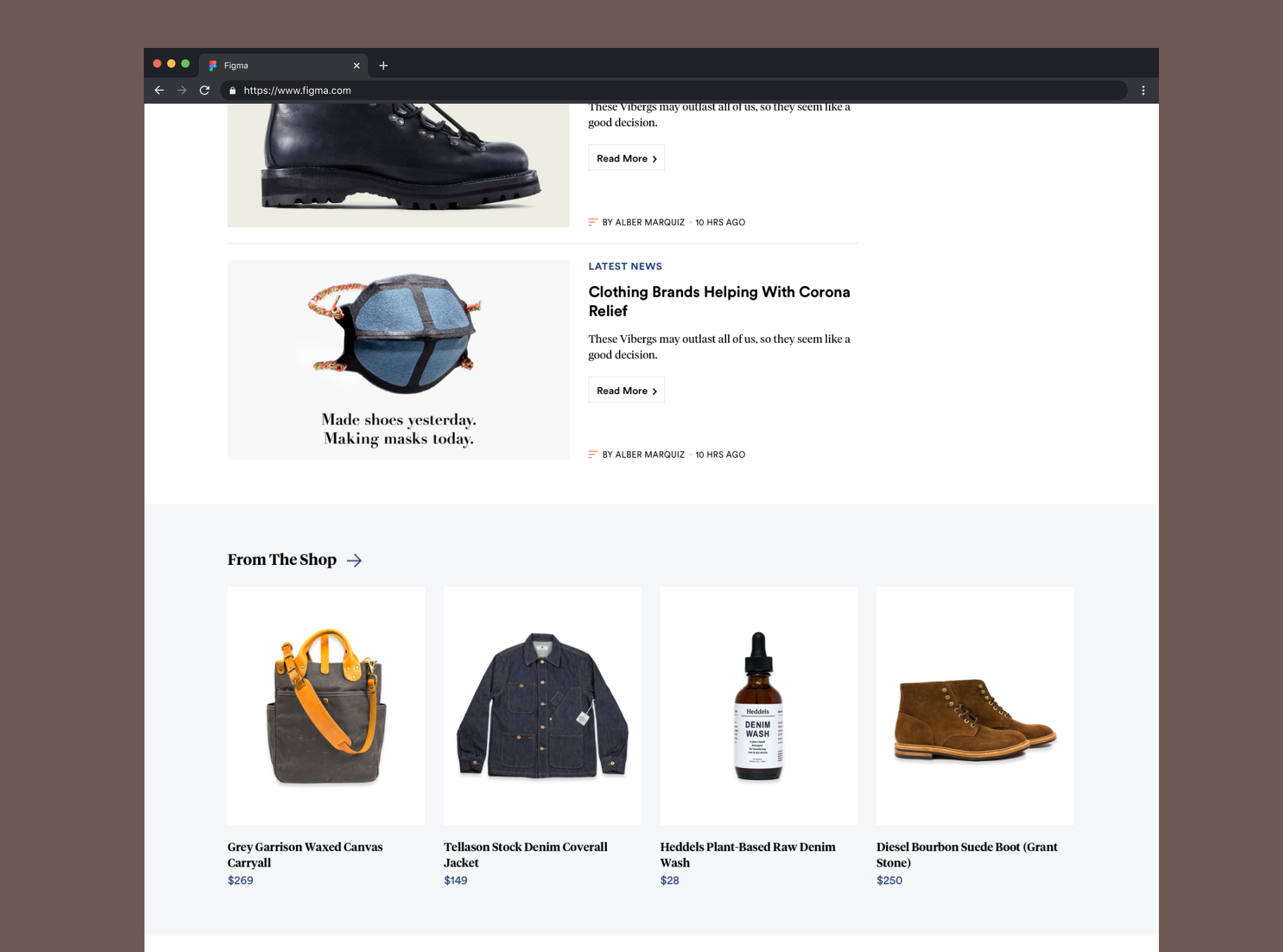
A component designed to showcase the latest and popular articles.
The Shop Module:
This module was incorporated on the homepage to highlight the Heddels ecommerce part of their brand, a place where their readers can purchase goods they read about.
The Footer:
Heddels footer was updated with a new subscription sign up modal, a component showcasing the latest articles and new navigation items.

Capturing the audience's attention and increasing readership.

The article page was redesigned in a way meant to allow viewers to digest information with ease. It also takes into account space for standard advertisements. A large bold headline is followed by the main image with a new slider navigation, newly designed sharing functionality, Next and Previous article component and related article component.

Heddels Article Styla A:
Article Style A uses a standard layout with content on the left and sidebar items on the right.
Heddels Article Styla A:
Article Style A uses a standard layout with content on the left and sidebar items on the right.
Heddels Article Styla B:
User for features and interviews, article Style B uses a centered content layout for longer articles.
Heddels Article Styla B:
User for features and interviews, article Style B uses a centered content layout for longer articles.

Scalability

Refining the mobile experience.

Built on a fully responsive design system, and building off the minimalist approach to desktop, we ensured a smooth and seamless transition to mobile which included re-invisioning the navigation.

“Good design is like a refrigerator—when it works, no one notices, but when it doesn’t, it sure stinks.”